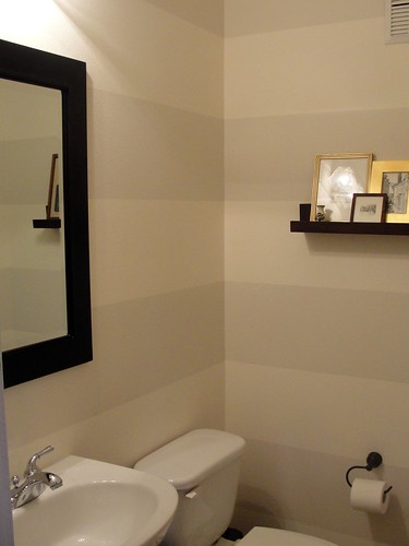
The other exception was the powder room. It was lime green and for the life of me, when the rest of the interior colors are natural, muted tones, I cannot figure out why the little room was painted lime green. This room is tiny, about four and a half feet by four feet. The lime green was overwhelming.
I decided that gray would be a good color for the room. The trouble I discovered is that gray has undertones of blue and green in it, depending on the lighting and the shade of gray. The gray I selected, when painted over the lime green, became a nauseating gray-green combination. Not a pretty color, trust me.
Then I decided to go with a neutral, albeit boring, beige. I mean, how exciting was I expecting my little powder room to be? Once the walls were painted, however, the little room looked and felt like being inside a drawer. The beige walls made it that much smaller and confining. It simply would not work.
I had no idea what to do at this point, so I went to the paint store and selected four colors simply because I liked them, two blues and two gray-browns. I purchased the samples and painted swatches on three of the four walls, observing what the light did to them. The earthiness of the brownish gray was appealing but the dark tones I had selected absorbed the light, again making me feel claustrophobic.
Oh boy, that was not a step in the right direction. Now my little powder room had a boring base of beige and three walls with four big swatches of equally unacceptable color choices.
Then I hit the design magazines and I noticed a little something: broad horizontal stripes make small places appear larger. Broad stripes? Could I do something so bold? With the right colors, I thought, yes I can.
So again, I set off to the paint store. I opted for two colors from Sherwin Williams' collection of whites, not a single one of which I would consider white, by the way. Specifically, I chose their Downy and Modest White (which is the darker of the two).
At this point, my painter, bless his heart, was looking at my little powder room and no doubt thinking, Of course she wants stripes. I also think that he was wondering how much of his life was going to be spent in this little room. He had his doubts as to my idea, which he voiced, but I insisted. And he painted the walls with the lighter color. Then he painted them again. And, yes, then again. Ultimately, it took four coats because I had painted such big swatches of the darker colors, and they kept showing through until, finally, the fourth coat of paint.
I think I should mention here that my painter's bank account was lving my indecision.
After several days to be sure the walls were dry, the painter set about taping the walls for the darker color stripes. What I saw was 12-inch stripes, with the leftover being at the ground level. What he saw was the enormous challenge of making the stripes perfectly straight. At one point, there were three of us in that little room, each holding a level above penciled lines, and then taping along those lines. Cozy? You bet!
When all was said and done, I was deliriously happy. My painter expressed his surprise at how nice the results were, and I beamed with renewed confidence.
Then I ran off to Pottery Barn and bought two floating shelves. I had the idea that I wanted to present the pencil sketches and pen and ink drawings, and the like, that I've collected from various travel locations, all (thankfully) similarly framed although at no other time had I placed in single grouping.
The room is so small that I cannot take a full-on photo of it, and these photos look as if I've hung the shelves way too high, but these give you a good enough idea.
Tell me please, what do you think?


7 comments:
I think it looks fantastic!
Love, love, LOVE it!
Bravo!!!
WOW, when will you be available for design consultant work?
I think it looks beautiful. Your persistance paid off handsomely!
-sdhb
Those stripes. Who woulda thunk it? Clever, but not in your face. Organized, but just the right amount of wild and crazy. Classic, yet modern. Good job!
It's perfect!
Post a Comment